Visualize Data with the DataDog API
Utilize the DataDog API to create a Timeboard
- Create timeboard with these features:
Your custom metric scoped over your host.
Any metric from the Integration on your Database with the anomaly function applied.
Your custom metric with the rollup function applied to sum up all the points for the past hour into one bucket
Include the script you’ve used to create the board
This board was created using the PostMan API editor using the content of this curl command.
curl -X POST \
  https://api.datadoghq.com/api/v1/dashboard \
  -H 'Content-Type: application/json' \
  -H 'DD-API-KEY: <redacted>' \
  -H 'DD-APPLICATION-KEY: <redacted>' \
  -H 'Postman-Token: 60674f61-fc88-4bcd-8d08-581d1cdc6613' \
  -H 'cache-control: no-cache' \
  -d '{
  "title": "Zero2Datadog Hourly Anomalies",
  "description": "A custom agent check configured to submit a metric named `my_metric` with a random value between 0 and 1000.",
  "widgets": [
        {
          "definition": {
                "type": "timeseries",
                "requests": [
                  {
                        "q": "my_metric{host:gearbox09.dev.controlplane.info}"
                  }
                ],
                "title": "My Hourly Metric",
                "show_legend": false,
                "legend_size": "0"
          }
        },
        {
          "definition": {
                "type": "timeseries",
                "requests": [
                  {
                        "q": "sum:my_metric{host:gearbox09.dev.controlplane.info}.rollup(sum, 3600)",
                        "metadata": [
                          {
                                "expression": "sum:my_metric{host:gearbox09.dev.controlplane.info}.rollup(sum, 3600)",
                                "alias_name": "my_hour"
                          }
                        ],
                        "display_type": "line",
                        "style": {
                          "palette": "dog_classic",
                          "line_type": "solid",
                          "line_width": "normal"
                        }
                  }
                ],
                "yaxis": {
                  "label": "",
                  "scale": "linear",
                  "min": "auto",
                  "max": "auto",
                  "include_zero": true
                },
                "title": "My Hourly Rollup",
                "time": {},
                "show_legend": false,
                "legend_size": "0"
          }
        },
        {
          "definition": {
                "type": "timeseries",
                "requests": [
                  {
                        "q": "anomalies(avg:mysql.performance.cpu_time{host:gearbox09.dev.controlplane.info}, '\''basic'\'', 2)",
                        "display_type": "line",
                        "style": {
                          "palette": "dog_classic",
                          "line_type": "solid",
                          "line_width": "normal"
                        }
                  }
                ],
                "yaxis": {
                  "label": "",
                  "scale": "linear",
                  "min": "auto",
                  "max": "auto",
                  "include_zero": true
                },
                "title": "Anomalous CPU Activity",
                "time": {},
                "show_legend": false
          }
        }
  ],
  "template_variables": [
        {
          "name": "host",
          "default": "gearbox09",
          "prefix": "host"
        }
  ],
  "layout_type": "ordered",
  "is_read_only": true,
  "notify_list": [
        "jitkelme@gmail.com"
  ],
  "template_variable_presets": [
        {
          "name": "Saved views for Gearbox09",
          "template_variables": [
                {
                  "name": "host",
                  "value": "gearbox09"
                }
          ]
        }
  ]
}'
Visualize Data with the Web UI
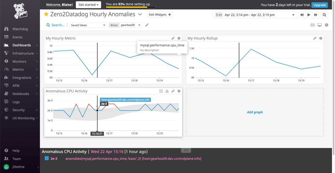
Once this is created, access the Dashboard from your Dashboard List in the UI:
Set the Timeboard’s timeframe to the past 5 minutes
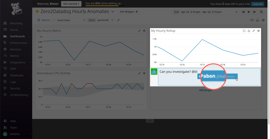
Take a snapshot of this graph and use the
@notation to send it to yourself.
Timeboard with five-minute intervals
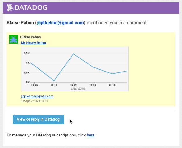
When you receive an email notice of the snapshot, it includes a thumbnail, and also buttons that take you directly to the item in the DataDog panel.
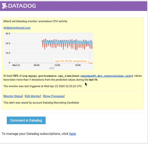
Bonus: What is the Anomaly graph displaying?
The anomaly graph is displaying observations that are more than two standard deviations from the norm. It is using the basic algorithm, based on a lagging rolling quantile.
In fact, when an anomaly alert is triggered, the email notification automatically describes some of these details, as you can see in this image: